Logo Design Portfolio

 Hassle Free Lawns
This logo was created with simplicity being the key as the ownsers of the artificial grass company wanted to portray a sleek, memorable looking logo.
 Welch
Electrical Services
Welch
Electrical Services
This logo was created with the keyword 'professional' in mind so a bold font was used & strong colours. The lines in brown,yellow/green & blue are the same as electrical cable.
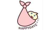 NappyDayz
(disposable nappies)
NappyDayz
(disposable nappies)
This logo was created for the now number 2 selling nappy company in Italy. Light, soft colours were used & the idea came from the saying 'the stork brought the baby home' .
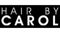 Hair
By Carol
Hair
By Carol
This logo was created to portray elegance & have a feel of class. White text on black background looks crisp. Inspiration came from the 'Clairol' text logo.
 LilZo.Com
This logo was created to look funky & futuristic. The light & dark blue colours show trust & ease of use, also to show the site as a bright, new & fresh idea / service.
 theworkplace
This logo was created to look corporate & elegant yet be direct to the point on what the service/business is all about. The use of colours was made to show youthfulness as the business is new & a fresh idea in the area.
 TwtMailer.Com
This logo was created to be like the service - simple & straightforward. The service sends emails to registered users upon an action so the envelope is addressed to "@USER, you've got replies...".
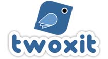 Twoxit.Com
This logo was created to show the simplicity of the website design and script function. The 'bird' is a neat design with curved & sharp edges to show that the site/script is strong but easy to use.
 CrispyIP.Com
This logo was created to be futuristic yet have an old computer look. The dark red colour which fades into a very light red gives the text depth and a sleek feel.
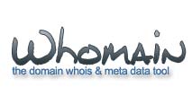 Whomain.Com
This logo was created to show that the website is simple to use and yet is professional. The gradient on the font makes the logo look slightly futuristic.
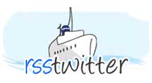 RSSTwitter
This logo is very easy on the eye, this is the same as the service they offer. The light / pale blue colours with a cartoon styled ship in the center still show a professional presence.
 CarClubs
Uk
CarClubs
Uk
This logo looks very simple yet very fresh. The colour red has been used with a glossy paintwork effect which looks very crisp and stylish.
 VisitCamposol.Com
This logo is one of the simplest logos i've designed, but the aim was not to be too fussy and just get straight to the point. Using a crisp yet classy font fading from light blue down to dark blue the logo looks high-class.
 SongSnatch
We also designed the website which the owner now maintains. This design needed to be different from the other music sites, so i decided to create the effect of being a 'cut-out' and using the keyword 'snatch' used hands in the design.
 ViewVid
Using a film reel as the main feature item of this logo we added the websites domain name & slogan to the left to add balance. Using black / greyscale colours with a gradient in the text makes the logo slightly vintage looking.
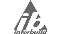 Interbuild
Simple yet effective logo design. The triangle being an important feature of the logo: strength. Slightly customized font makes the logo unique.
 Hike
& Bike Spain
Hike
& Bike Spain
This nice looking logo was create to showcase the services that Hike & Bike Spain offer, walking & cycling holidays, accommodation etc. The main triangle background made to look like a mountain.
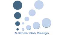 D.White
Web Design
D.White
Web Design
Simple, Smart, Straightforward - this logo was created to show that each point leads to the same place, the solution.
 2Let2Sell2Buy.Com
When we designed this logo each roof was meant to represent the property services clients would require - selling, letting & buying property. Again blue was used, being a trusting colour.
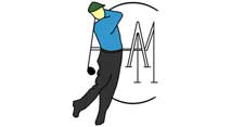 ACAM
Golf Packages Spain
ACAM
Golf Packages Spain
As the company name suggests, golf packages to suit all! So the design had to get golf across instantly which the golf swinging man portrays along with the name ACAM to the right.
 Sunsea
Properties
Sunsea
Properties
Re-designing this logo was simple, as the original was quite the same. we simple tidied up the lines... the 'waves' being perfectly parallel with each other and the 'sun' being a perfect circle and distance from the 'waves'.
 S&S
Conservatories
S&S
Conservatories
Again, blue being the colour scheme with the roof and window being main features of their business made this design the right & easy choice.
 Need
A Hand
Need
A Hand
Your house in good hands... This was the message this logo had the aim of getting across. Using blue as a trusting colour the image of the hand holding the home works well.
 House
Of Windsor Inc.
House
Of Windsor Inc.
Based in Florida this company needed a look that would portray class and the English so we thought the idea of windsor, royalty and the family crest - bingo! Blues & gold's make this logo stand out but still remain traditional.
 CarParkCruisers.Co.Uk
Originally a modified car club which has now turned into world wide modified car profile website have had this logo for many years - using a futuristic font and adding a 'roof' over the letters made this a logo similar to most car clubs window stickers but just that bit special.
 Mob4u1
This is the third re-design of the mob4u1 logo, the idea of the M for 'mob4u1' and the surrounding circle border being an area - interpreted as mobile phone signal coverage. Blue being a trusting colour at the time was the main colour used.
 Swirl
Hair Studios
Swirl
Hair Studios
Designed for a small hair salon this logo needed to be eye catching, trendy but non fussy. So using only 2 shades of blue & 1 shade of dark grey the was referred to be funky yet corporate.